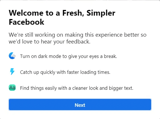
What is called the “New Facebook” is the more streamlined UI, on par with the transitioning UI norms and preferences amongst the users.
Users were Notified
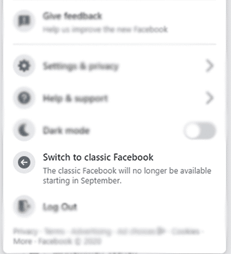
Coming September 1, the old Facebook UI will be gone forever as users across the globe got the notification a day or two back, as they logged into their accounts.
Users were NotifiedThat’s Not AllBeta Testing Lasted for Months
You can manually try the new Facebook UI on your computer through the account button. Click on the button and choose the “Switch to new Facebook” option.
That’s Not All
Bidding farewell to your familiar old Facebook can be painful, but the New Facebook UI comes bearing gifts.
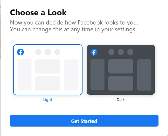
There is a much-needed dark mode for power users who have the dark mode set on their different apps on their smartphones and other smart devices. Looking at white for a long haul can be damaging for your eyes, which is why many power users prefer the dark mode.
Beta Testing Lasted for Months
The new Facebook UI was available as an option to users for over 6 months. Being the curious lad, I decided to switch to the new UI and have not looked back. Although the first impression was unsettling over time, I got used to the new streamlined user-interface. The content was spaced out, and the entire wide-screen monitors were put to use. Secondly, the new UI is designed to keep the waste of screen resolution to the minimum.


